Learning Book Cover Market Trends

How researching your genre and market can help you give your book the right cover
Cover creation is one of the hardest things for books because it’s the first impression readers get.
It requires an eye and some knowledge of graphic design. It requires tools to create the cover. And it requires your ability to accept feedback.
And if you find you aren’t cut out to make a good cover for your book, then the suggestion is to take a graphic design course or hire a book cover designer.
Did you know that it’s actually not uncommon for publishers or authors to give their books a new cover?
This is because the market always changes. After all, the reader’s interests can change.
Publishers and authors pay attention to the market simply for the fact that in the next five years, their book may not gain as much attention because the cover doesn’t feel on trend anymore. And this can even happen if the book has hundreds of reviews.
This is also why doing research into your genre and market can pay off in a big way in terms of keeping your book in the eye of readers.
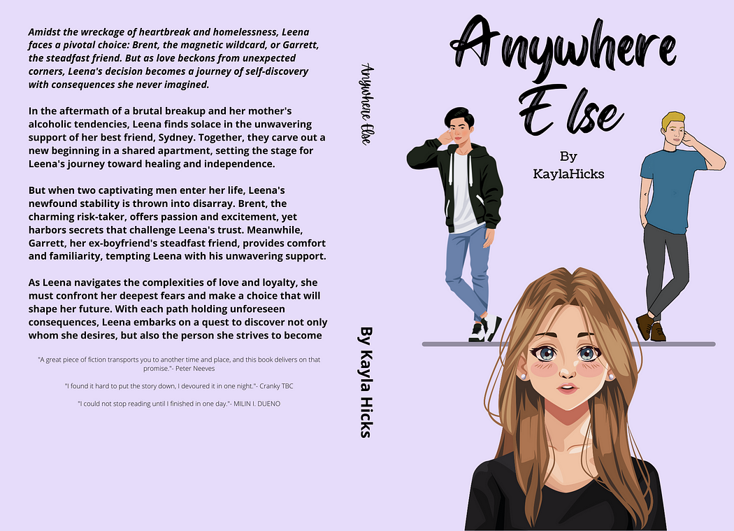
For example, my book Anywhere Else has gone through three cover facelifts in its lifetime, but after doing extensive research, I think this will be the last for some time.
In the beginning, like many other authors, I had a small background in design and not a lot of money, so I tried my hand at making my book covers. Now, they weren’t bad, per se, but they weren’t what would stop a reader in their tracks and purchase it.
Here is the evolution:

First cover
Now admittedly, this one was not great…like it was bad.
I knew that the Young Adult Contemporary Romance market was showing interest in more cartoon-like covers, so I tried it. Needless to say, it didn’t turn out great. And my skills were not nearly what they are now.

Second cover
This one I really loved and I truly thought it was an improvement. And I did have readers show interest in the characters on the cover. But they only showed interest which didn’t convert to sales.
So, after some time on the market and not really any new sales, I decided to try changing my description.
I’d managed to make it sound a whole lot better, but it still didn’t feel like it was the problem. This caused me to dive back into cover research on other YA contemporary romance books that were doing well. And lots of them were still using cartoonish-style covers.
Maybe this was why my book wasn’t doing well.
So I tried once more.

New cover
Before I decided on this cover, I shared on social media my current cover and this one. I asked what people thought and explained my situation. And guess what, I got helpful feedback.
Some people said this was a huge improvement and way more on trend for my genre. Other people said they thought the orange cover was way too busy and that was why it wasn’t doing well. And some people said that it was simpler and that drew them in more than the orange.
So, this seemed to be the winner. And I have to agree. As much as I loved the orange cover, this feels more right and I hope it will do the book the justice it deserves.
After I’d conducted my market research, I learned about:
The types of fonts the genre expected
The color schemes readers were used to
How much and how little to add to the cover
Where I wanted to draw the reader’s eye to

When it comes to cover creation and what’s on trend in the market, know that it’s okay to not get it right the first time.
I knew I had a good book based on the 30 reviews I’d received. I just needed to work on the presentation.
Trust your gut and keep trying.
